banking
User Interface Design and User Testing for DNB Online Banking
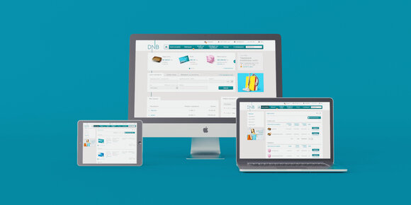
DNB was looking for a developer who could “count clicks”, i.e. create a modern, ergonomic, easy-to-use online banking interface where everything a customer needs would be just a few clicks away. This became the main criterion for developing a new online banking interface that would increase the number of new customers, improve existing customer satisfaction and loyalty, and ease the excessive processing load of the bank’s call centres and branches.
The recent swift evolution of new technologies and increasingly varied customer demands motivated the introduction of a new solution, as the previous interface had been in use for 6 years at the moment the new version was launched.
RESEARCH, INTERVIEWS AND TESTS
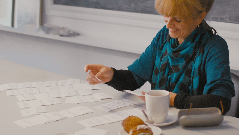
We decided to involve DNB clients in the creation of a graphical user interface that would meet their everyday needs and habits. We conducted face-to-face interviews with people from each target group. Based on questions prepared by a usability expert, we interviewed clients about their everyday needs, experience and habits in the digital environment. In the second part of the interview, we applied the card-sorting method in order to build an information arhitecture (site map) for the online interface and give each section an easily comprehensible title. The interface has some 120 sections with different options and content, which makes it especially important that the user be able to navigate it without difficulties.
WIREFRAMES AND TESTING
After concluding interviews and analysing the gathered information, we proceeded to the next stage of the project – developing wireframes, in which we defined each section's content, functions and priorities. During several consecutive consultations with the bank’s Product, Marketing and IT department, as well as members of the boards, 90 different wireframes were created.
To ensure the effectiveness of the interface and fine-tune remaining details, we organized wireframe testing. Those involved in the tests had to complete regular banking tasks by clicking on the prototype. The tests were documented by video recording the computer screen and the user’s facial expressions. The obtained data were processed and analysed in detail by the usability expert, who then applied the necessary changes to the wireframes.
WEB DESIGN, FRONT-END AND TESTING
Taking into account the bank’s graphic identity, a graphic concept of the online interface was created, including a detailed design for each section of the website. After developing HTML, CSS and JavaScript, we thoroughly tested it on computers and tablets that used different operating systems and the latest versions of web browsers, in order to ensure the same experience for all users.
Tested HTML, CSS and JavaScript solutions were then delivered to the IT department of DNB bank to be integrated into their online banking system.
Before launching the new version, selected customers were invited to test and evaluate the new graphic interface during actual work using real data.
INNOVATIONS
Nowadays, the life of the internet user moves fast and requires navigating many websites and interfaces. People may use online banking services just once a week or less, but they do use Google, email or social networks on a daily basis and have become more proficient at them than business-related systems.
Therefore we introduced into our banking interface new principles that users are familiar with from other web services:
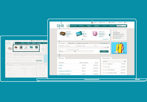
- The desktop principle: frequently used functions are available on the home page right after signing in
- Personalization: a different graphic icon for each account; changing the name of an account
- An auto-complete option for payments: payment information is automatically saved, which makes it simpler to use the same information in future transactions
- The option to send your account number easily
RESULTS
On April 24 2013, the new online banking interface was launched. Most DNB clients are satisfied with the innovative functions and find them useful; 85% of respondents stated that they “very much” liked that the account could be identified with a graphic icon, and the auto-complete option.
In the first six months, the new interface helped increase the number of active clients by 16% and reduce the amount of phone calls to the call centre by 27%.
A/S DNB is part of one of the largest Norwegian financial groups and is one of the leading financial organizations in the Nordic region.
DNB Group operates in 19 countries worldwide, providing a wide range of services to private individuals as well as business enterprises.
